


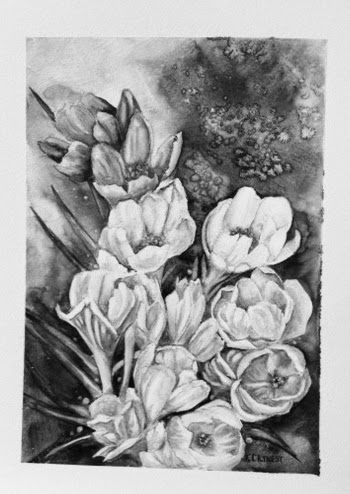
This particular painting was planned to teach a different way of dealing with backgrounds. The crocus flowers are like jewels, the background is the platinum setting that shows off the jewels . The background on the crocus was really fun to do, many colors running together, salt, kleenex . . . anything and everything! Experimenting can be a lot of fun, and especially with watercolor, if you don't like it wipe it out and try something else.

 The crocus painting is a really good example of color values. I have two photos of the painting, one is in color, the second I deleted the color in photoshop. Sometimes when working in color it is hard to see values. What do I mean by values? The variation in one color from light to dark in one area. For instance, we see a leaf as green, dark or light. If we put another color next to it, lets say we put a dark blue next to a dark green, they are the same value, change them to black and white and you would not be able to see the difference between the two colors. A green leaf may have as many values as you want to put into it, and with the addition of each value you add shape and dimension. As you can see in the black and white photo, even in the background you can see the different values, I used a darker value to make the flowers "pop". the green leaves, although dark and the background is dark, the value of the leaf is a little darker and by pulling a bit of color out of the center they are easily visible. The black and white version of the painting holds together as well as the colored photo, so for me this is a very successful piece. You can test your own paintings for values by getting a black and white copy made When you are first learning to work with values it is a great help.
This week we worked on a daisy painting, a simple painting of a simple flower. The original painting was done a few years ago as the background for a poster. Each year I did a different flower grouping in front of a

The lesson to learn from this painting is how to paint white flowers. Simple? Not really. It is too easy to fill too much of the white petals with shadow, then losing the whole idea of a white flower. I have found it easier to pick my background color, in this case paynes gray, and lightly put that in around the outside edge of the flower petals. Now I have given the flower shape, I also know where to put in the shadows on the petals to give them dimension. Again this is where the values of the shadows create

some leaves are in front other are in back. I used sap green, new gamboge and paynes gray to achieve that. Sap green is my mid value/tone, for the darker areas I added paynes gray in increments so I ended up with four or five different values of dark green. The same thing was done to the leaves up front by adding new gamboge several times to get different values and then is some areas using my 1/4" flat to pull out some paint along edges. A good rule of thumb is darkest dark next to you lightest light creates depth.
When you paint you are the magician, you create the illusion of light, shadow, color, depth and emotion. You decide how much of each will be in each of your creations.

I post a new painting each week of the class, however I do not expect you to finish a painting a week, so please do not stress out if you only get one or two of the paintings done. This class is a place for you to relax, have some fun, and learn a little along the way. Be as creative with the paintings as you wish, but most of all enjoy what you are doing.
See you all next week, enjoy your weekend!!

Love everything.
ReplyDelete