Friday, April 18, 2014

4-15-14 - Daisey Day

Great class this week, the crocus painting was hard but the finished paintings are great, and I am sure the paintings that are still in progress will turn out wonderful. As the paintings get done I will post them here on my blog.


This particular painting was planned to teach a different way of dealing with backgrounds. The crocus flowers are like jewels, the background is the platinum setting that shows off the jewels . The background on the crocus was really fun to do, many colors running together, salt, kleenex . . . anything and everything! Experimenting can be a lot of fun, and especially with watercolor, if you don't like it wipe it out and try something else.

In my last blog I mentioned that I made a mistake on one of the yellow flowers, but decided to live with it, well that only lasted for one day. I kept looking at the painting, going to that one flower and it really bothered me. The yellow flowers created a line in the middle of the painting, nope can't live with that, so out comes the 1/4" flat. I carefully wet the flower and pulled the color out until all that was left was a faint yellow cast. I then used some white gesso in the area of the flower, if you remember this painting was done on watercolor board coated with gesso, that gave me a pure white to put in the shading for a white flower. I am a much happier with the finished piece now!

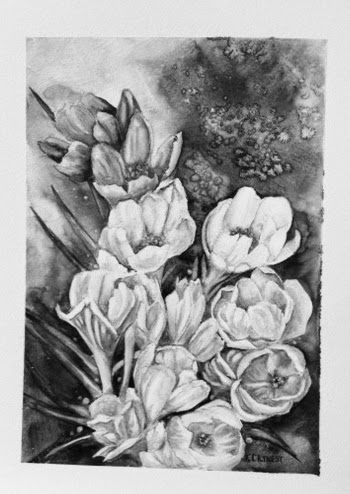
The crocus painting is a really good example of color values.  I have two photos of the painting, one is in color, the second I deleted the color in photoshop. Sometimes when working in color it is hard to see values. What do I mean by values? The variation in one color from light to dark in one area. For instance, we see a leaf as green, dark or light. If we put another color next to it, lets say we put a dark blue next to a   dark green, they are the same value, change them to black and white and you would not be able to see the difference between the two colors. A green leaf may have as many values as you want to put into it, and with the addition of each value you add shape and dimension. As you can see in the black and white photo, even in the background you can see the different values, I used a darker value to make the flowers "pop". the green leaves, although dark and the background is dark, the value of the leaf is a little darker and by pulling a bit of color out of the center they are easily visible.  The black and white version of the painting holds together as well as the colored photo, so for me this is a very successful piece. You can test your own paintings for values by getting a black and white copy made When you are first learning to work with values it is a great help.

This week we  worked on a daisy painting, a simple painting of a simple flower. The original painting was done a few years ago as the background for a poster.  Each year I did a different flower grouping in front of a
picket fence for the poster, since daisies are one of my favorite flowers I kept the painting and now shared it with you. When I gave you the pattern I did not put the fence in, and left that up to you whether you put it in or not. The colors used in this painting are paynes gray, sap green, new gamboge, and a touch of cad red. Paynes gray can be a little tricky, it is made from black and ultramarine blue. Some manufacturers don't use enough ultramarine so you may have to add more to get the desired effect. The cad red is used only for the flower centers for shading.

The lesson to learn from this painting is how to paint white flowers. Simple? Not really. It is too easy to  fill too much of the white petals with shadow, then losing the whole idea of a white flower. I have found it easier to pick my background color, in this case paynes gray, and lightly put that in around the outside edge of the flower petals. Now I have given the flower shape, I also know where to put in the shadows on the petals to give them dimension. Again this is where the values of the shadows create
dimension. Look at the color photo then at the black and white. The objects in the painting still retain their shapes, what is front still keep the illusion of being in front. Probably the best example of the values can be seen in the leafy area at the bottom of the painting. You can see the depth of the plant,
some leaves are in front other are in back. I used sap green, new gamboge and paynes gray to achieve that. Sap green is my mid value/tone, for the darker areas I added paynes gray in increments so I ended up with four or five different values of dark green. The same thing was done to the leaves up front by adding new gamboge several times to get different values and then is some areas using my 1/4" flat to pull out some paint along edges. A good rule of thumb is darkest dark next to you lightest light creates depth.

When you paint you are the magician, you create the illusion of light, shadow, color, depth and emotion. You decide how much of each will be in each of your creations.


Next week we will be starting on a tree peony painting with a bit of an oriental flair.  No background on this painting, so you must be careful with your edges.  I am posting the painting partial done and will continue the painting in class. This painting is about color mixing, you will note the different green of the leaves and the flower itself is a peach color.

I post a new painting each week of the class, however I do not expect you to finish a painting a week, so please do not stress out if you only get one or two of the paintings done. This class is a place for you to relax, have some fun, and learn a little along the way. Be as creative with the paintings as you wish, but most of all enjoy what you are doing.

See you all next week, enjoy your weekend!!


Thursday, April 10, 2014

Last Class

Watercolor Class - April 8th

WOW!! This class is huge! I had planned on the first class to do a crocus painting using a little different method and a few twists. What I hadn't planned on were so many new students who weren't use to painting with me. So, I apologize for the confusion last week. How I like to work in the class is to have a painting done and hand out a pattern for that, then do another painting of a piece of the larger painting to demonstrate how I did the larger painting. I work with each student as I walk around the class. The pattern for the next class is posted on this blog by Friday before the next class along with a series of photographs showing how I painted the piece. You can download and make it the size you want to work with or you can wait until class to get the pattern.

Next week we will be painting white daisies, here is the pattern.


I had planned to make 3 of the flowers white, but while I was working with the yellow I forgot and made one of the flowers that was supposed to be white yellow. The top right yellow flower in white would have made the composition better, but I will have to live with it. As I worked on this area I cleaned the edges of the petals from the inside with a damp 1/4" flat then added more dark around the flowers to give the petals a cleaner line. When you are trying to keep your lines clean be sure the area where you are working is dry. The yellow flowers, to me, are the closest, so there is more detail in them with a cleaner line, as I work my way up the edges bleed into the background a bit more. I am cleaning up some of the pencil lines at this point but I am leaving some too.


This is how I am starting the white flowers, I
am using the same purple, ultramarine blue
and alizarin crimson-more towards the reddish
side of purple, that is in the background with lots of water added. If you look at the photo carefully you can see the hard edges of the wash I put in. Even after the wash is down and dry you can take a wet, not dripping, brush and go along the edge of the line and the pigment will move into a nice gradual shadow. Once the purple is down
you can use your 1/4" flat to wipe out some of the color to create the white shapes. Remember, your darkest darks work best next to your lightest lights.

I used the same purple color for the shading on this flower, but then added some paynes gray to get the heavy darkness is a few areas and also added some alizarin crimson to the two back petals in the back to give it some interest. I did the centers the same on both of the white flowers I filled in the center with the same darker yellow then with a semi dry brush I dragged some of the yellow up the petals. When the yellow was almost totally dry I went in with a small round brush and made circles with cad red, leaving a yellow center. After it had dried I added some of the dark purple for shadows. Using the 1/4" flat I cleaned up the color out of the flower petal edges and folded over tips. I wanted them to be perfectly white if possible. The very last thing I did was with the tip of my small round, I pulled the color out of the center of some of the center circles. Again make sure when you pull color out clean your brush and wipe on a paper towel. You want it to be just damp enough to grab the pigment sitting on top.

First purple flower, work it pretty much the same as the other flowers, using a reddish purple - alizarin and ultramarine. To do the darker areas use more concentrated color, the lighter areas use more water, less concentrated color. When the paint is almost dry, use a damp brush to pull out the highlights. I did the same color combination for the center. If you look closely at these photos, you can see the lines that the coat of gesso on the watercolor paper has left.


When I got to the last flower it needed to be a little darker than the flower in front of it, so I altered my formula, adding more ultramarine and a little less of the alizarin. For the really dark shadows I added a little paynes gray. At this point I realized that I had the point of a leaf sticking out behind the last flower, and angle of it needed a base somewhere. So using my ever handy 1/4" flat, I used the edge to pull the background color out below the top flower and to the left of the other purple flower. The background color has to be removed to make the green of this leaf match the others even though it is back further.

Now is the time to see what needs to be done to finish this painting. I erase as much of the pencil lines around the flowers as I want gone, leaving some here and there. I then added more dark background color around the flowers to make the petals stand out more, I also added the same dark in the centers of the flowers that had stamens showing. I sharpened up some of the whites by pulling some more of the color out. When I did the background I had pulled out some little circles down on the left hand side to add some interest,  in the completed piece I really liked the way they looked down there and decided to add a few more. Finally I was satisfied with how it ended up looking and finally signed my name! So off comes the tape and I am very happy with how the painting ended up.


I hope this has helped you finish your painting. If you need more help with it bring it back to class. If you have finished it be sure to bring it in for the critique.

Critique you say? Yes at the end of the class I like to have all the students put their work up front, sounds scary I know, but after a while you will enjoy seeing what everyone else is doing and learn to make changes or have questions answered that will make your paintings better.

Have a lovely weekend, enjoy the promised sunshine and we shall meet again on Tuesday.

Thursday, April 3, 2014

Spring is in the Air!

It seems like last winter lasted longer than usual and I am more than ready for spring to appear. The grass is green and growing, the trees are blooming and the air smells of growing things. Must be time for spring classes to start!

 There are only two seats left in the Flowers in Watercolor class, and 6 seats left in the Drawing class. The drawing class will be working on portraits in graphite, colored pencil, charcoal and watercolor. Plus we will be doing some figure drawing from a model, so it should be an interesting 7 weeks.

In the watercolor class we will be doing lots of beautiful flowers, crocus, daises, roses,  peony, tree peony, iris and cherry blossoms. I thought is would be fun to learn to do some Chinese brush painting, thus the cherry blossoms and if there is time we may do another cat!

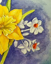
The last class we did in watercolor was of a jonquil and I was unable to get the series of how I did the painting on line, so I will do it here.

 We start this painting by putting in the background first, a combination of ultramarine blue and alizarin crimson, to get it darker I added some paynes grey. Normally I paint the flowers first and then put in my background, I do that because it gives me a little more freedom with painting the flowers. When you put the background in first you are locked in on where the flowers  and leaves are going to be. On this painting putting in the background first shows the shapes of the white flowers. I may go back in after the flowers are painted and darken some of the background even more if the composition needs it.


The jonquil is painted with two shades of yellow, we will be using the darker yellow for the outer petals of the flower. I did not wet the petal before putting on the paint, start at the base of the petal and pull the color out to the end of the petal, clean your brush in water, wipe all excess water out and pull some of the pigment off to give it some dimension. On these three petals you can see I pulled some color off to make it appear that there is a line down the center. Use the same technique you would use when you paint leaves. Remember too that you don't want to work on petals next to each other so  the color doesn't bleed from one petal to the next.

 You can see in this picture where I have pulled color out with a 1/4" flat damp brush to  create lines.


 The center photo shows that I have darkened up even more around the base of the petals using more pigment and less water. In the bottom photo you can see that the center has been painted with the lighter yellow then used the darker yellow in the center. When you are painting the lighter yellow in be careful to leave the out edge of the trumpet very light, pull out the color if need be. Leaving the edge light gives the center dimension. The darker shadows are purple made with ultramarine blue and alizarin crimson.

Now it's time to work on the paper whites. First paint the centers with a orange made with your dark yellow and cadmium red med. Remember it is a cup shape, so dark on one edge and then pull some of the color out of the center.


Do all of the centers, changing where the dark side of the cup is by which way the flower is facing. Flowers facing to the left will have the dark to the right, flowers facing to the right will have the dark side facing to the left. When you have done them all if you want to up the dark side add some cad red.

Now you can paint the stems and leaves, using sap green with yellow added to the lighter stems and ultramarine blue added for the darker areas.

For the shading in the white flowers you are going to use the same color as the background. For the lighter shadows add more water to the darker areas less water more pigment.

One of the last things I did on this painting is putting some of the background color in the orange centers to accent the cup shape. You want to make sure that the orange is dry before you put this in.


 Here you can see the greens are all in and only the paper whites on top need to be finished.
This is the finished piece, you can see that I have darkened some of the background a bit more and punched up the darks in the petals.

The only thing left for you to do is sign your name!


The first painting we will be doing next week is of a group of crocus and here is the drawing.  You can print it out and put it on your paper or I will have copies for the class.


Hope to see you in class!!

Friday, February 28, 2014

Flowers Bloom in the Watercolor Class

  As artists we have the ability to take the darkest, dreariest day and with a few strokes of brilliant color bring the warmth of a summer sun into the room.


 It always amazes me how the whole class starts out with the same drawing and the same colors, but look how each person's personality comes through in their painting. As a teacher I feel the greatest success when my students take what I share and start to develop a style all their own.

This is my own  painting of tulips.

 
 Next week we are going to do a much different type of painting. Up until now I have done a detailed drawing and a rather tight painting. Little water and a lot of pigment. This time we will using a lot of water and little pigment, a much faster way of painting. Loose and quick strokes give paintings a shimmery spontanious look. We will be doing lilacs, the one scent that tells us that spring is finally come. This is the watercolor that I have done, and I will be demonstrating this technique in class.


The drawing is very general, just an approximation of what will be painted. I will have this pattern for the students on Tuesday.

Everyone in the portrait class is working on their finished piece, several are working in colored pencil for the finished piece. Not an easy task, many layers of color go into making a good skin tone ergo, many hours of work. As you can see the portraits are going very well. Next week I'll put on new photos so you can watch their progress.


Only two more weeks of classes, the classes fly by, but to see how everyone has grown is especially satisfying to me, not to mention meeting a lot of very cool people. Have a creative week!!

Friday, February 14, 2014

Classes - February 18th

We are already at week 4 of this session of classes and boy are these students keeping me on my toes! In the watercolor class we have done a tree peony, a rose and last week a hibiscus, here are some students work from the first two weeks.


The top row are some of the tree peonies and the second row, obviously are roses. Really nice job. It is difficult to do shading and highlights using the white of the paper for the variation in tones and these are really very well done. I will post more as they get done. I can't wait to see some of the finished hibiscus paintings next week.

This week we are going to tackle a problem that faces artists who work from real flowers. If you are a fast painter you won't have to worry about this, but for most of us it can cause a lot of frustration. Flowers continue to open and grow as soon as they are put in water, they reach their perfection state and then proceed to wilt and die. For some flowers that can all happen in a few hours. We can take photos of the flowers and hope the color and lighting stays the same, or we can do quick sketches and use those for the composition and quick color swatches for the color, or we can trust our memories and paint what we remember. So for this project we will be working on tulips. I had a lovely bouquet of red and yellow tulips which I took several photos of. To do the composition I envision I will be using the photo's to draw the tulips in different positions to form the bouquet I want to paint. Here is a montage of the photo's I just took along with some from last year, and the white ceramic pitcher that I am going to use as a vase.


Notice that all of the photos have the same light source, that way my shadows will all work when I start my painting. When I draw my composition I am more concerned with the shape of the flowers than the color of a particular flower. At this point in the process I am also looking at the values and how they will affect the final composition. I will draw the flowers and the vase completely and then decide how the composition will be cropped on the paper. So before I put the drawing down on my watercolor paper, I have worked out my composition, the pattern of my values, and the pattern of my color. I do this work at the beginning of a painting so when I start I can concentrate on just painting.  And that after all is the fun part!


Sorry these are so dark but I hope you can see what I did. This first drawing is how I start the vase. Drawing in the general shape of the object, the box, then dividing that space in half, then drawing in the horizontal and vertical lines where the vase changes shape I can construct the shape of the vase that is the same on both sides.


Now I draw in shapes where the flowers are going to be. This is where the composition starts to take shape.


Once I have an idea of where the flowers are going to be I start to draw in the different tulips, referencing the photo for individual shapes.


Beginning shading has been added and leaves. You can see here that I also thinned down the bottom of the vase to follow the actual vase. This drawing will be my guide when I start to paint for light source, and shading. All of these drawings are done on tracing paper. Using the tracing paper allows me to keep what I like on to the next drawing, or move object a bit without having to start over. Saves a lot of time and  aggravation.


Here is the final pattern for the painting. You can see that I have made some changes from the last drawing. When I look at this I see several ways to crop that would make an interesting painting, so my challenge to you is for you to crop the drawing however you see the best painting result. Be assured there is no wrong way to do this, if you like the whole composition use it, if you see one tulip that speaks to you then do that. What ever you decide to do it will be your creative voice. Good luck can't wait to see what you all do!!!

I would be terribly remiss if I didn't put up some of the pieces from the drawing class. The first week we did some up close work with eyes, the second week it was portrait on tinted paper with graphite and white charcoal, this last week it was conte on tinted paper. Absolutely brilliant work by these artists.


Next week we will be starting on a portrait rendering, using either graphite, conte, or colored pencil. The subject is up to the artists so this should be fun and very interesting!!

I hope you all are having a very happy Valentines day!

Thursday, February 6, 2014

Watercolor Class 2-11-14

Great class last Tuesday, everyone started on the pink rose and progressed pretty far along. To get and keep the pink clean can sometimes be very difficult, this is one of those paintings where it's really important to have clean water when painting. When doing a large flower with many petals I wet each petal with lean water before putting any pigment down, the first wash of color is very light and then progressive layers of color until the depth of color I want is reached. It is also important to remember to leave white paper where there are highlights. It is surprising sometimes to find that even the lightest wash of red is impossible to take out I can't wait until next week to see the finished pieces. I will take some photo's to share in next weeks blog.

This coming Tuesday the flower we will be starting is a yellow hibiscus with a bright red center. The photograph the painting is being done from was taken by Bertha Moore on a trip to Hawaii, very well done. When you look at the flower it looks to be fairly simple, unfortunately it is a bit more difficult. I started out using two yellows, cad yellow and new gamboge. If you look carefully at the photo you can see the areas on the petals where the lighter yellow fades into a yellow that is a bit more golden yellow, if needed a small bit of cad red can be added to get the color to the golden hue. Before the yellow was completely dry I laid in a light wash of cad red in the center of each petal all the way to the bottom. On the bottom of the petals I added cad red, alizarin crimson and a bit of paynes gray. These petals are very thin, and the shadow of the dark green leaves shows through, that is achieved with very light washes of paynes gray. Be very careful doing that, leave an edge of cad yellow along all the petals. The center stamen uses the same colors as the petals. Put a light coat of cad yellow light on the whole stem, add a small amount of cad red at the bottom while the yellow is still a bit damp to let the colors blend, then a light wash of paynes gray for shadows. Mix a small amount of cad yellow and cad red to get a bright orange, apply to the 3 pollen ends, and use new gamboge with a small amount of paynes gray to darken it enough to make the other pollen ends stand out against the petals.

The green of the hibiscus leaves is a very dark and shiny green. I used sap green as a base and then added paynes gray for the darkest areas and sap green and ultramarine blue for a lighter green. To give the leaves a feel of good dimension I left the edges light. The photo has 2 buds in it, I chose not to add any for this piece, but if you choose to do so feel free.


Have fun with this one!

This session of the drawing class we are concentrating on drawing portraits. The first class we worked on doing eyes. As you have probably heard me say over and over the most important part of the portrait is the eyes. The ancient Egyptians believed the eyes were the windows to the soul  and I have found that so true when doing portraits. If you can capture the personality of the eyes the portrait is successful. The critique at the end of the class showed that everyone did a great job on the eyes. The last class we worked on rendering on tinted paper with graphite and white charcoal. This as a bit of a challenge because you have to think a bit differently. The tinted paper is the mid tone, the graphite the darks and the white charcoal the highlights. I think everyone is doing a great job and I will get photos of the finished pieces next week and post them. As an example I am posting a self portrait from this class.


I haven't  done a self portrait in over 30 years, rather fun to do. I do like the results of the tinted papers. This was done on Bordon and Riley, Pastel/Charcoal paper with a 6B, HB and white  charcoal pencil. Toned paper does not have to be gray, but that seems to be what you see the most of.

Have a creative week!