Wednesday, April 23, 2014

Tree Peony - 4-22-14

What a talented group of painters in the watercolor class! Each week I am more and more impressed by the quality of work being produced. Last week the project was white daisies, not as easy as it sounds. White flowers on white paper without using any white paint can be a real challenge. As you can see the challenge was well met.


And as a real plus one talented artist painted a very charismatic cat that is worth sharing.


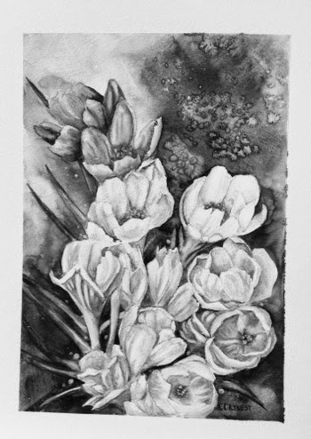
This last Tuesday the project was a tree peony with a little oriental twist and a very limited palette.

The main color of the flower is a peach color created with Cad Red and Lemon Yellow, (or Cad Yellow light), variations on the color are made by adding Alizarin and New Gamboge.

The green for the leaves is created by mixing Cerulean Blue and New Gamboge, it makes a lovely green. To darken use a touch of Paynes Grey, lighten by adding more yellow.

The stems of the tree peony are woody, so I created the color by using the peach color and the green of the leaves, the two colors combined make a wonderful brown. The cerulean blue gives the brown a misty look.
One of the secrets to a more dimensional flower
is how you handle the shadows in each petal of the flower. This tree peony has ruffled edges on the outer edge of each petal. When you paint in the shadows on the petals look at the ruffles, choose to put the shadow where the ruffle comes down into the petal, by putting the shadow there it makes the outward ruffle come forward. For this flower it is really important to try and show the shadows of the crinkling of the petals. Think of crepe paper, with its many wrinkles, that is the closest material I can think of that is similar to the tree peony petal.
I do one petal at a time, wetting the area with clean water then dropping in the color. As the
paper dries I keep adding darker color where needed or pulling out color for highlights. I try to get all my color on each petal before it dries completely. The colors blend together much better when just slightly wet. Too wet and the pigment floats on the water, too dry and you can see the additional layers sitting on top.
The next petal should be away from the one you just worked on, to keep the petals distinct from each other and give dimension to the flower. Remember where you have the darkest shadow, the lightest light goes next to it. I usually work my way around the flower by doing every other petal, by the time I have worked my way around
 the flower the petals are dry and I can start to fill in until all the petals are painted. This drawing has petals that have little  turns, or fold overs, where you see the back of the petal. This is another opportunity to give the flower more dimension.  On the inside of the petal there will be a strong shadow to make the fold over stand away from the rest of the petal, the edge of the back of the petal needs to be lighter gradually getting darker as it goes towards the base. Think of a sea shell as you shade in the area. 
This is also a good time to think of your values. Values give your flower dimension. Without the dark shadows and highlights the flower will appear flat, the petals just lying on top of one another. Values make the petals appear to have space between them and to give the flower a 3 dimensional look.
Learning to see and work with values can make the difference between a very successful painting and a mediocre piece. For this painting see if there are areas that would benefit from 
darkening. If you add some dark in the lower left area ( using numbers on a clock), at 8, then add some dark at 12 an 4. That will balance the color in your flower. Do the same with the lights.This may sound like a broken record but as you paint remember your darkest darks go next to your lightest lights.
For the center of the flower, I put in a line of dark along the edge of the petal in front with my darkest shadow color, then softened the inside edge with a damp brush. Using my small round (#4) I put dots of new gamboge at different heights above the dark shadow. When that was dry I used my small brush and drew fine lines around the yellow dots and put a tiny dot in the center of each yellow dot and drew a line down into the shadow. You can pull out some dots in the shadow with the point of a clean damp brush.
Now it is time to put in the krinkle lines on the petals. Think
again about a sea shell, the lines have to curve with the shape
of the petal. Straight lines will flatten the petal, by curving
your lines you add more dimension. The lines start at the bottom close together, as they move up towards the middle they spread apart and close up again as they go towards the top. Very few of the lines reach the top edge of a petal. The lines can wiggle a little, break apart and start again.  Try to keep them from looking mechanical, vary the length and spacing. I used straight cad red, use only the very tip of your smallest round brush. Hold the brush straight up and down and do quick strokes, the more you do the easier it gets. One of the major differences between the tree peony and a regular peony is that the tree peony does not die back in the winter, the stems are woody. So for this painting the stem is painted a warm brown,  created by using my darkest flower color and my darkest leaf color. You can see in the photo at left on the branches that are thinner leading to the leaves, the stems change to the dark green of the leaves.  The leaves are painted
 with a mixture of the cerulean blue and new gamboge, leaning towards the blue. In some areas I dropped in the color
of the flower to give the leaves movement. When I paint leaves like these I tend to paint half of the leaf at a time leaving a thin white line between the halves. Sometimes I will go back in and darken the line to one side to create a shadow. Like the flower petals, there are no straight lines in the leaves, the lines follow the curving of the leaves. You want your leaves to have movement, curved lines do that.
The last two things I painted were the small bud at the bottom and the opening flower at the top. Both of these were added to the composition to make the color flow. These were worked the same way as the large flower. Even though I added the flower color to the leaves, the big bright color of the flower creates a "hole" in the composition. The viewers eye does not flow through the painting. By adding  the flower color
at the bottom and then again at the top the viewers eye is pulled into, up and out of the painting. With no color to help in the background the composition has to do all the work.
The very last thing to do is erase as much of the pencil lines as possible. If you have left the edges of the petals very light you will get a very nice "lost edge" effect on the flower.
Okay the very last thing to see on this painting is to check if my values hold up. Are there enough darks, is there a pattern of darks to make the pieces hold together? Do the light areas sparkle?


Check your paintings out by making a black and white copy, it will show you any changes that need to be made. This is one of the best learning techniques you can employ.

Nest Tuesday we will be doing a magnolia, 'Queen" of the spring bloomers. Here is the pattern. Have a great weekend!


Friday, April 18, 2014

4-15-14 - Daisey Day

Great class this week, the crocus painting was hard but the finished paintings are great, and I am sure the paintings that are still in progress will turn out wonderful. As the paintings get done I will post them here on my blog.


This particular painting was planned to teach a different way of dealing with backgrounds. The crocus flowers are like jewels, the background is the platinum setting that shows off the jewels . The background on the crocus was really fun to do, many colors running together, salt, kleenex . . . anything and everything! Experimenting can be a lot of fun, and especially with watercolor, if you don't like it wipe it out and try something else.

In my last blog I mentioned that I made a mistake on one of the yellow flowers, but decided to live with it, well that only lasted for one day. I kept looking at the painting, going to that one flower and it really bothered me. The yellow flowers created a line in the middle of the painting, nope can't live with that, so out comes the 1/4" flat. I carefully wet the flower and pulled the color out until all that was left was a faint yellow cast. I then used some white gesso in the area of the flower, if you remember this painting was done on watercolor board coated with gesso, that gave me a pure white to put in the shading for a white flower. I am a much happier with the finished piece now!

The crocus painting is a really good example of color values.  I have two photos of the painting, one is in color, the second I deleted the color in photoshop. Sometimes when working in color it is hard to see values. What do I mean by values? The variation in one color from light to dark in one area. For instance, we see a leaf as green, dark or light. If we put another color next to it, lets say we put a dark blue next to a   dark green, they are the same value, change them to black and white and you would not be able to see the difference between the two colors. A green leaf may have as many values as you want to put into it, and with the addition of each value you add shape and dimension. As you can see in the black and white photo, even in the background you can see the different values, I used a darker value to make the flowers "pop". the green leaves, although dark and the background is dark, the value of the leaf is a little darker and by pulling a bit of color out of the center they are easily visible.  The black and white version of the painting holds together as well as the colored photo, so for me this is a very successful piece. You can test your own paintings for values by getting a black and white copy made When you are first learning to work with values it is a great help.

This week we  worked on a daisy painting, a simple painting of a simple flower. The original painting was done a few years ago as the background for a poster.  Each year I did a different flower grouping in front of a
picket fence for the poster, since daisies are one of my favorite flowers I kept the painting and now shared it with you. When I gave you the pattern I did not put the fence in, and left that up to you whether you put it in or not. The colors used in this painting are paynes gray, sap green, new gamboge, and a touch of cad red. Paynes gray can be a little tricky, it is made from black and ultramarine blue. Some manufacturers don't use enough ultramarine so you may have to add more to get the desired effect. The cad red is used only for the flower centers for shading.

The lesson to learn from this painting is how to paint white flowers. Simple? Not really. It is too easy to  fill too much of the white petals with shadow, then losing the whole idea of a white flower. I have found it easier to pick my background color, in this case paynes gray, and lightly put that in around the outside edge of the flower petals. Now I have given the flower shape, I also know where to put in the shadows on the petals to give them dimension. Again this is where the values of the shadows create
dimension. Look at the color photo then at the black and white. The objects in the painting still retain their shapes, what is front still keep the illusion of being in front. Probably the best example of the values can be seen in the leafy area at the bottom of the painting. You can see the depth of the plant,
some leaves are in front other are in back. I used sap green, new gamboge and paynes gray to achieve that. Sap green is my mid value/tone, for the darker areas I added paynes gray in increments so I ended up with four or five different values of dark green. The same thing was done to the leaves up front by adding new gamboge several times to get different values and then is some areas using my 1/4" flat to pull out some paint along edges. A good rule of thumb is darkest dark next to you lightest light creates depth.

When you paint you are the magician, you create the illusion of light, shadow, color, depth and emotion. You decide how much of each will be in each of your creations.


Next week we will be starting on a tree peony painting with a bit of an oriental flair.  No background on this painting, so you must be careful with your edges.  I am posting the painting partial done and will continue the painting in class. This painting is about color mixing, you will note the different green of the leaves and the flower itself is a peach color.

I post a new painting each week of the class, however I do not expect you to finish a painting a week, so please do not stress out if you only get one or two of the paintings done. This class is a place for you to relax, have some fun, and learn a little along the way. Be as creative with the paintings as you wish, but most of all enjoy what you are doing.

See you all next week, enjoy your weekend!!


Thursday, April 10, 2014

Last Class

Watercolor Class - April 8th

WOW!! This class is huge! I had planned on the first class to do a crocus painting using a little different method and a few twists. What I hadn't planned on were so many new students who weren't use to painting with me. So, I apologize for the confusion last week. How I like to work in the class is to have a painting done and hand out a pattern for that, then do another painting of a piece of the larger painting to demonstrate how I did the larger painting. I work with each student as I walk around the class. The pattern for the next class is posted on this blog by Friday before the next class along with a series of photographs showing how I painted the piece. You can download and make it the size you want to work with or you can wait until class to get the pattern.

Next week we will be painting white daisies, here is the pattern.


I had planned to make 3 of the flowers white, but while I was working with the yellow I forgot and made one of the flowers that was supposed to be white yellow. The top right yellow flower in white would have made the composition better, but I will have to live with it. As I worked on this area I cleaned the edges of the petals from the inside with a damp 1/4" flat then added more dark around the flowers to give the petals a cleaner line. When you are trying to keep your lines clean be sure the area where you are working is dry. The yellow flowers, to me, are the closest, so there is more detail in them with a cleaner line, as I work my way up the edges bleed into the background a bit more. I am cleaning up some of the pencil lines at this point but I am leaving some too.


This is how I am starting the white flowers, I
am using the same purple, ultramarine blue
and alizarin crimson-more towards the reddish
side of purple, that is in the background with lots of water added. If you look at the photo carefully you can see the hard edges of the wash I put in. Even after the wash is down and dry you can take a wet, not dripping, brush and go along the edge of the line and the pigment will move into a nice gradual shadow. Once the purple is down
you can use your 1/4" flat to wipe out some of the color to create the white shapes. Remember, your darkest darks work best next to your lightest lights.

I used the same purple color for the shading on this flower, but then added some paynes gray to get the heavy darkness is a few areas and also added some alizarin crimson to the two back petals in the back to give it some interest. I did the centers the same on both of the white flowers I filled in the center with the same darker yellow then with a semi dry brush I dragged some of the yellow up the petals. When the yellow was almost totally dry I went in with a small round brush and made circles with cad red, leaving a yellow center. After it had dried I added some of the dark purple for shadows. Using the 1/4" flat I cleaned up the color out of the flower petal edges and folded over tips. I wanted them to be perfectly white if possible. The very last thing I did was with the tip of my small round, I pulled the color out of the center of some of the center circles. Again make sure when you pull color out clean your brush and wipe on a paper towel. You want it to be just damp enough to grab the pigment sitting on top.

First purple flower, work it pretty much the same as the other flowers, using a reddish purple - alizarin and ultramarine. To do the darker areas use more concentrated color, the lighter areas use more water, less concentrated color. When the paint is almost dry, use a damp brush to pull out the highlights. I did the same color combination for the center. If you look closely at these photos, you can see the lines that the coat of gesso on the watercolor paper has left.


When I got to the last flower it needed to be a little darker than the flower in front of it, so I altered my formula, adding more ultramarine and a little less of the alizarin. For the really dark shadows I added a little paynes gray. At this point I realized that I had the point of a leaf sticking out behind the last flower, and angle of it needed a base somewhere. So using my ever handy 1/4" flat, I used the edge to pull the background color out below the top flower and to the left of the other purple flower. The background color has to be removed to make the green of this leaf match the others even though it is back further.

Now is the time to see what needs to be done to finish this painting. I erase as much of the pencil lines around the flowers as I want gone, leaving some here and there. I then added more dark background color around the flowers to make the petals stand out more, I also added the same dark in the centers of the flowers that had stamens showing. I sharpened up some of the whites by pulling some more of the color out. When I did the background I had pulled out some little circles down on the left hand side to add some interest,  in the completed piece I really liked the way they looked down there and decided to add a few more. Finally I was satisfied with how it ended up looking and finally signed my name! So off comes the tape and I am very happy with how the painting ended up.


I hope this has helped you finish your painting. If you need more help with it bring it back to class. If you have finished it be sure to bring it in for the critique.

Critique you say? Yes at the end of the class I like to have all the students put their work up front, sounds scary I know, but after a while you will enjoy seeing what everyone else is doing and learn to make changes or have questions answered that will make your paintings better.

Have a lovely weekend, enjoy the promised sunshine and we shall meet again on Tuesday.

Thursday, April 3, 2014

Spring is in the Air!

It seems like last winter lasted longer than usual and I am more than ready for spring to appear. The grass is green and growing, the trees are blooming and the air smells of growing things. Must be time for spring classes to start!

 There are only two seats left in the Flowers in Watercolor class, and 6 seats left in the Drawing class. The drawing class will be working on portraits in graphite, colored pencil, charcoal and watercolor. Plus we will be doing some figure drawing from a model, so it should be an interesting 7 weeks.

In the watercolor class we will be doing lots of beautiful flowers, crocus, daises, roses,  peony, tree peony, iris and cherry blossoms. I thought is would be fun to learn to do some Chinese brush painting, thus the cherry blossoms and if there is time we may do another cat!

The last class we did in watercolor was of a jonquil and I was unable to get the series of how I did the painting on line, so I will do it here.

 We start this painting by putting in the background first, a combination of ultramarine blue and alizarin crimson, to get it darker I added some paynes grey. Normally I paint the flowers first and then put in my background, I do that because it gives me a little more freedom with painting the flowers. When you put the background in first you are locked in on where the flowers  and leaves are going to be. On this painting putting in the background first shows the shapes of the white flowers. I may go back in after the flowers are painted and darken some of the background even more if the composition needs it.


The jonquil is painted with two shades of yellow, we will be using the darker yellow for the outer petals of the flower. I did not wet the petal before putting on the paint, start at the base of the petal and pull the color out to the end of the petal, clean your brush in water, wipe all excess water out and pull some of the pigment off to give it some dimension. On these three petals you can see I pulled some color off to make it appear that there is a line down the center. Use the same technique you would use when you paint leaves. Remember too that you don't want to work on petals next to each other so  the color doesn't bleed from one petal to the next.

 You can see in this picture where I have pulled color out with a 1/4" flat damp brush to  create lines.


 The center photo shows that I have darkened up even more around the base of the petals using more pigment and less water. In the bottom photo you can see that the center has been painted with the lighter yellow then used the darker yellow in the center. When you are painting the lighter yellow in be careful to leave the out edge of the trumpet very light, pull out the color if need be. Leaving the edge light gives the center dimension. The darker shadows are purple made with ultramarine blue and alizarin crimson.

Now it's time to work on the paper whites. First paint the centers with a orange made with your dark yellow and cadmium red med. Remember it is a cup shape, so dark on one edge and then pull some of the color out of the center.


Do all of the centers, changing where the dark side of the cup is by which way the flower is facing. Flowers facing to the left will have the dark to the right, flowers facing to the right will have the dark side facing to the left. When you have done them all if you want to up the dark side add some cad red.

Now you can paint the stems and leaves, using sap green with yellow added to the lighter stems and ultramarine blue added for the darker areas.

For the shading in the white flowers you are going to use the same color as the background. For the lighter shadows add more water to the darker areas less water more pigment.

One of the last things I did on this painting is putting some of the background color in the orange centers to accent the cup shape. You want to make sure that the orange is dry before you put this in.


 Here you can see the greens are all in and only the paper whites on top need to be finished.
This is the finished piece, you can see that I have darkened some of the background a bit more and punched up the darks in the petals.

The only thing left for you to do is sign your name!


The first painting we will be doing next week is of a group of crocus and here is the drawing.  You can print it out and put it on your paper or I will have copies for the class.


Hope to see you in class!!