Great class last Tuesday, everyone started on the pink rose and progressed pretty far along. To get and keep the pink clean can sometimes be very difficult, this is one of those paintings where it's really important to have clean water when painting. When doing a large flower with many petals I wet each petal with lean water before putting any pigment down, the first wash of color is very light and then progressive layers of color until the depth of color I want is reached. It is also important to remember to leave white paper where there are highlights. It is surprising sometimes to find that even the lightest wash of red is impossible to take out I can't wait until next week to see the finished pieces. I will take some photo's to share in next weeks blog.
This coming Tuesday the flower we will be starting is a yellow hibiscus with a bright red center. The photograph the painting is being done from was taken by Bertha Moore on a trip to Hawaii, very well done. When you look at the flower it looks to be fairly simple, unfortunately it is a bit more difficult. I started out using two yellows, cad yellow and new gamboge. If you look carefully at the photo you can see the areas on the petals where the lighter yellow fades into a yellow that is a bit more golden yellow, if needed a small bit of cad red can be added to get the color to the golden hue. Before the yellow was completely dry I laid in a light wash of cad red in the center of each petal all the way to the bottom. On the bottom of the petals I added cad red, alizarin crimson and a bit of paynes gray. These petals are very thin, and the shadow of the dark green leaves shows through, that is achieved with very light washes of paynes gray. Be very careful doing that, leave an edge of cad yellow along all the petals. The center stamen uses the same colors as the petals. Put a light coat of cad yellow light on the whole stem, add a small amount of cad red at the bottom while the yellow is still a bit damp to let the colors blend, then a light wash of paynes gray for shadows. Mix a small amount of cad yellow and cad red to get a bright orange, apply to the 3 pollen ends, and use new gamboge with a small amount of paynes gray to darken it enough to make the other pollen ends stand out against the petals.
The green of the hibiscus leaves is a very dark and shiny green. I used sap green as a base and then added paynes gray for the darkest areas and sap green and ultramarine blue for a lighter green. To give the leaves a feel of good dimension I left the edges light. The photo has 2 buds in it, I chose not to add any for this piece, but if you choose to do so feel free.
Have fun with this one!
This session of the drawing class we are concentrating on drawing portraits. The first class we worked on doing eyes. As you have probably heard me say over and over the most important part of the portrait is the eyes. The ancient Egyptians believed the eyes were the windows to the soul and I have found that so true when doing portraits. If you can capture the personality of the eyes the portrait is successful. The critique at the end of the class showed that everyone did a great job on the eyes. The last class we worked on rendering on tinted paper with graphite and white charcoal. This as a bit of a challenge because you have to think a bit differently. The tinted paper is the mid tone, the graphite the darks and the white charcoal the highlights. I think everyone is doing a great job and I will get photos of the finished pieces next week and post them. As an example I am posting a self portrait from this class.
I haven't done a self portrait in over 30 years, rather fun to do. I do like the results of the tinted papers. This was done on Bordon and Riley, Pastel/Charcoal paper with a 6B, HB and white charcoal pencil. Toned paper does not have to be gray, but that seems to be what you see the most of.
Have a creative week!
Thursday, February 6, 2014
Thursday, January 30, 2014
A New Year and New Classes
Time sure flies anymore, it seems like not so long ago it was the start of 2013 and here we are January 2014. Last year was a busy, busy year, lots of paintings, lots of classes, lots of gallery shows, in other words...it was a GREAT year!!! And it looks like 2014 is going to be just as great if not greater.
Classes have started at Green River and I will be using this blog to post the next weeks project for the water color class and as the class finishes their paintings I will post some of them. This session has 11 students, from total beginner to experienced, so this is going to be a lot of fun!! This week the project was a tree peony on 300lb water color paper. For the next 2 weeks we will be concentrating on just a flower head. the purpose of that is learning how to handle the ratio of water and pigment, and letting the water do most of the work. Whether you paint very loosely or tight how and when you use water will make a huge difference in the outcome of your painting. For this project the petal being painted was painted with clean water, when the sheen from the water was gone the watered down pigment was applied from the base up, letting the water on the paper pull the pigment along to the top of the petal. If there were shadows from curled petals the shadow was then applied. The main pigments used in the painting were alizarin crimson, with a touch of new gamboge, the shadow is ultramarine blue. To get the very dark reddish color I used alizarin and paynes grey. The center was painted new gamboge with areas of cad yellow medium, then using a mixture of alizarin, new gamboge and ultramarine (creating a dark reddish brown) I outlined the little stamens. After that was dry I went in with a small damp brush and pulled out some of the yellow to give the stamen highlights. I did put a background on this flower of a purple made with alizarin and ultramarine, after that had dried I ran some cobalt blue on one side and paynes grey over the top for interest.
Next Tuesdays painting will be of a pink rose, my sample is painted on Ampersand's watercolor board with a 2" cradle. I am beginning to really like these watercolor boards because after the painting is finished I can just varnish and hang, no framing or glass to deal with. The painting was done with alizarin, cad red medium, new gamboge, ultramarine blue and paynes grey (hmmmm I am beginning to see a pattern here!). Yes I do use the same colors over and over, occasionally adding a another color if needed, this is what is called developing a palette. It is not necessary to purchase every tube of paint made to be able to paint a picture. Working with a limited palette will teach you more about color mixing than anything else. Again this painting was done in a similar manner as the tree peony, wet a petal with clean water (and this cannot be said enough, CLEAN water, do not use the water you clean your brushes with, it can ruin your painting), with a wet brush dipped in watered down pigment apply color from the bottom of the petal to the outer edge of the petal. In watercolor less is more, you can always darken a color, but it is a lot of work to lighten a color if it can be done at all. Using white paint is not really an option with water color, adding white turns your color into a pastel instead of a lighter version of the color you are working with. The white of the paper you are painting on is the white that you use in the painting. Lighter colors are attained by adding water to the pigment, the amount of water you add plus how wet the paper is results in the color you get on the paper. Darker colors are less water more pigment. Working the way I do, wetting a petal at a time, means that you only want to work on a new petal if the one next to is is totally dry or you will get bleeding over and lose the lines of the flower. Then it is just a matter of going around until all the petals are painted, go in and do some final touch ups of dark and the painting is finished.
Here is the finished painting.
And here is the drawing for the painting.
You can do this any size you feel comfortable with, my painting is 6" square. If you can have this reproduced on your paper by class time it will give you more time to work on the painting in class.
Remember the most important thing about art, be it drawing or painting, is to have fun with it. Every painting will not be a masterpiece, but every painting is a learning experience. So have fun and
GO HAWKS!!!
Friday, November 1, 2013
Watercolor Class
Wow the students in my watercolor class are really good artists! They are keeping me on my toes to stay ahead of them. So far on week one they did a daylily. I hope you can see the photos, I did not do a very good job of taking the pictures and the paintings are much better than what is showing.
Week two, we worked on a single iris.
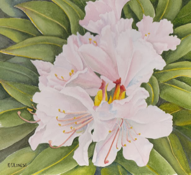
Week 3, we worked on a very pale pink rhodie. This is my painting, there were no finished pieces in class, but I will get some before the class schedule ends.
Week four, we did a sunflower. The first painting is mine. The last three are from students.
Week five, we worked on a stargazer lily. This was the painting that I did.
And week six we will be doing a red poppy painting. Underneath the painting is the pattern for this painting. You may download and have on your paper before class is you have time.
Week seven I will demonstrate mounting and varnishing a watercolor painting. It is the last class so any unfinished paintings can be finished.
I will take more photo's of finished pieces to post. This has been a great class and a lot of fun to teach. There are absolute beginners in the class and they are showing real talent. From beginners to professional the key to a great finished painting is to believe in yourself. Every painting is not a masterpiece, it is however a learning experience, that will make you better on the next painting and all the paintings after that. Never give up, the more you create, the easier is will be to believe in yourself. You can do it, I believe in you.
Thursday, October 10, 2013
Watercolor Class 11-15-13
What a great group of ladies in the watercolor class! Each and every one is doing a great job on their paintings. I wanted to take photo's of the finished daylily paintings this week but forgot my camera, hopefully some will be brought back to class next week. This week was a much harder project, a picatee type iris. A lot of work to get done in a 2 hour period so most of the paintings were not finished so I can't wait to see what they look like next week.
Next week we will start a painting of a very pale pink rhodie. This piece is difficult because you want to be able to keep the pale translucency of the petals, but still get enough darkness there to show dimension. Because I have not finished my painting yet I've shown you the line drawing made from the photo we will be working from. A big Thank you to Liz Reynolds who sent me this photo a few years ago. I have held on to it because I knew at some point it would make a great painting.
Next week I will remember to take my camera and get photos of the iris and hopefully at least one or two of the daylilies.
Thursday, October 3, 2013
Classes
Classes started last Tuesday and I was happy to see some familiar faces and lots of new, eager to learn faces! It's going to be a fun semester!
I plan the first class to show me where everyone is at and what I will need to do for each student. There are real newbies, no experience in painting or drawing, and really proficient artists sharpening their skills. One of the things that make these classes so much fun is diversity of talent. There were groans from the new students when I announced that the last 30 to 20 minutes of class would be a critique, and smiles from the returning students. At the end of the class and critique there were smiles all the way around. It is a great learning experience for everyone. Not only do you get to see everyone's work, you also get input on your piece and encouragement to get better. I really want everyone involved to leave the class feeling that they have accomplished something. Not every piece of art is a masterpiece, nor is it ever a complete failure, but every piece of art IS a learning experience.
It is important to develop confidence in yourself as an artist. Criticism of your art is not a criticism of you as a person, and should be taken as food for thought and growth for the next piece of art. I am more apt to keep a drawing or painting that didn't work as I am one that did. I want to see where my error was and how I did it so I do not repeat it.
The drawing class had a pretty difficult still life to render, and everyone did a really good job.
The first photo is of the actual set up and the second is the drawing done by Bertha Moore. Both photo's were taken by Bertha. Doing a rendering of a still life is excellent for sharpening your skills of observation, composition, and values.
In next weeks class we will be working on composition.
Composition: 1) the nature of something's ingredients or constituents; the way in which a whole or mixture is made up. 2) the action of putting things together; formation or construction. 3) a thing composed of various elements.
What does that mean to you the artist? The ingredients are first, shape and value, then line and color. How these pieces fit together gives a good indication of the success or failure of the piece of art. A good composition brings the viewer into the story and engages them emotionally. It sounds daunting doesn't it, but Arthur Wesley Dow developed an almost foolproof way of learning composition.
Who was Arthur Wesley Dow? He was an American painter, printmaker, photographer and influential arts educator, 1857 to 1922. In his lifetime art was taught by the time honored approach of imitation. Students learned by copying what had been done before. Dow broke down the teaching of art to three structural elements: 1)Line, referring to boundaries of shapes and the interrelations of lines and spaces, 2)Notan, a Japanese word meaning "dark, light", referring to the quantity of light reflected, or the massing of tones of different values, and 3)Color, referring to quality of light.
We will be dealing with line first, creating shapes and spacing, then add Notan. Dark and light massing will reveal the mistakes in spacing. Color will reveal the weakness of dark and light. So as you can see these three structural elements are intimately related. You will find that it is much easier than it sounds and the improvement in your compositions will show immediately.
Next week in the watercolor class we will be working on an iris. Ruffled edges can sometimes be a bit of a challenge but in the end you have a lovely painting to call your own! Hopefully next week I will have some paintings to post from the class, so if you finish the daylily I hope you bring it with you to class for all to see and admire.
Tuesday, September 24, 2013
Back to School
Well this had to be one of the most beautiful summers in the Pacific Northwest, but like all good things it had to come to an end and the rains have come! Time to get busy painting, and I don't mean walls. I have been teaching drawing classes at Green River College for the past few years and this year in addition to a drawing class I will be teaching a class in two of my favorite things. . .watercolor and flowers. It was a great year for flowers this year and I collected a great selection of photos for reference in the class. Class starts next Tuesday and the first painting we will be doing is a daylily. This plant is right next to my driveway and blooms for weeks, the flowers are huge with multiple buds on each stem, the color is a bright gold that glows even on the dreariest days. Here is the photo that the class will be working from.
And here is the painting that I did from this photo.
It is on 300# Arches hot press paper, using Daniel Smith watercolors. The new element I am doing with my watercolors is mounting the painting and varnishing the piece. This eliminates the need for glass, matts and framing. I am mounting the painting using the Ampersan clayboard, on this piece the wooden rocker is 2" thick, so the piece can be hung or it will sit very securely on any flat surface. Another added benefit is that the rocker can be color coordinated with the painting. It takes a little time and effort but so far I really like the results.
I will be posting the photo and resulting painting every week and possibly if the students will allow it, photos of some of their paintings too.
Tuesday, June 4, 2013
Elliot
This is a portrait of a Elliot, a Bernese Mountain dog, who "works" at Cobber's Pet Pantry. He greats the customers who come in the door with a vigorous wag of the tail and a friendly grin. Cobber's is a great new addition to our community. They carry top of the line holistic and healthy food for pets, plus a very talented groomer on staff, and a self service washing area for pets. They will be doing dog training classes and seminars on healthy feeding. Now if you had asked me 6 months ago about what good food for Elvis and Albert I would have named a top of the line pet food I purchased at the local grocery store. Four months ago Elvis was diagnosed with a very rapid cancer, the vet said we could try surgery and chemo but with this type of cancer chances were slim. I made the choice not to put Elvis through that, but would attempt another course of action. The internet has a lot of information to go through but it was well worth the time. My friend Rick found a holistic Dr. and he prescribed several holistic medications. Elvis has lived several months beyond what the original vet thought he would, and as of this last Monday, the tumor is now half the size it was and he is doing very well!! Now back to Cobber's, they carry the foods that have attributed to Elvis's good health. Even Albert has been switched over, and has lost a much needed few pounds and gained a beautiful coat.
Elliot works with Cobber, meeting and greeting customers at the store, over and above their enthusiastic greeting it is well worth the time to visit Cobber's Pet Pantry if you have a cat or dog you care about.
Subscribe to:
Posts (Atom)